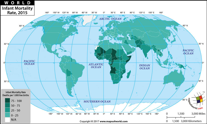
Infant mortality rate map clearly indicates that close to 61% of the world has an IMR of less than 25 deaths per 1,000 live births. Singapore, Japan, France, Portugal, Australia, UK, USA, Cuba, Russia, Greenland, Sri Lanka and Malaysia are just few countries belonging to this group.
Bhutan, Nepal, South Africa, Indonesia, Turkey and Syria are few of the 17% of countries with an IMR between 25 to 50 deaths. Tanzania, Guinea, Bangladesh, Kenya and North Korea in the year 2008 had an IMR ranging in-between 50 deaths to 75 deaths.
Republic of Congo, Ethiopia, Sudan, Malawi and Nigeria belong to the group of countries with an infant mortality rate of more that 75 and less than 100.
9 countries in the world including Zambia, Mali, Somalia, Afghanistan, Liberia, Sierra Leone and Angola have an infant mortality rate of more that 100 death of infants below the age of one per 1,000 live births. Angola has world's highest IMR that of 180.21 deaths/1,000 live births.
Infant Mortality Rate, 2015 | |
| Country | Mortality rate, infant (per 1,000 live births) |
|---|---|
| Andorra | 2 |
| Estonia | 2 |
| Finland | 2 |
| Iceland | 2 |
| Japan | 2 |
| Luxembourg | 2 |
| Norway | 2 |
| Singapore | 2 |
| Slovenia | 2 |
| Sweden | 2 |
| Australia | 3 |
| Austria | 3 |
| Belarus | 3 |
| Belgium | 3 |
| Cyprus | 3 |
| Czech Republic | 3 |
| Denmark | 3 |
| Germany | 3 |
| Ireland | 3 |
| Israel | 3 |
| Italy | 3 |
| Korea, Rep. | 3 |
| Lithuania | 3 |
| Monaco | 3 |
| Netherlands | 3 |
| Portugal | 3 |
| San Marino | 3 |
| Switzerland | 3 |
| Canada | 4 |
| Croatia | 4 |
| Cuba | 4 |
| France | 4 |
| Greece | 4 |
| Montenegro | 4 |
| Spain | 4 |
| United Kingdom | 4 |
| Bahrain | 5 |
| Bosnia and Herzegovina | 5 |
| Hungary | 5 |
| Macedonia, FYR | 5 |
| Malta | 5 |
| New Zealand | 5 |
| Poland | 5 |
| Antigua and Barbuda | 6 |
| Malaysia | 6 |
| Serbia | 6 |
| Slovak Republic | 6 |
| United Arab Emirates | 6 |
| United States | 6 |
| Chile | 7 |
| Kuwait | 7 |
| Latvia | 7 |
| Lebanon | 7 |
| Maldives | 7 |
| Qatar | 7 |
| Russian Federation | 8 |
| Sri Lanka | 8 |
| St. Kitts and Nevis | 8 |
| Ukraine | 8 |
| Brunei Darussalam | 9 |
| Bulgaria | 9 |
| China | 9 |
| Costa Rica | 9 |
| Uruguay | 9 |
| Bahamas, The | 10 |
| Oman | 10 |
| Romania | 10 |
| Argentina | 11 |
| Georgia | 11 |
| Grenada | 11 |
| Libya | 11 |
| Mexico | 11 |
| Syrian Arab Republic | 11 |
| Thailand | 11 |
| Barbados | 12 |
| Mauritius | 12 |
| Seychelles | 12 |
| Tunisia | 12 |
| Turkey | 12 |
| Albania | 13 |
| Armenia | 13 |
| Iran, Islamic Rep. | 13 |
| Kazakhstan | 13 |
| Peru | 13 |
| Saudi Arabia | 13 |
| St. Lucia | 13 |
| Venezuela, RB | 13 |
| Belize | 14 |
| Colombia | 14 |
| El Salvador | 14 |
| Jamaica | 14 |
| Moldova | 14 |
| Palau | 14 |
| Tonga | 14 |
| Brazil | 15 |
| Jordan | 15 |
| Panama | 15 |
| Samoa | 15 |
| Honduras | 17 |
| St. Vincent and the Grenadines | 17 |
| Vietnam | 17 |
| Ecuador | 18 |
| Paraguay | 18 |
| Trinidad and Tobago | 18 |
| West Bank and Gaza | 18 |
| Fiji | 19 |
| Kyrgyz Republic | 19 |
| Mongolia | 19 |
| Nicaragua | 19 |
| Suriname | 19 |
| Dominica | 20 |
| Egypt, Arab Rep. | 20 |
| Korea, Dem. People's Rep. | 20 |
| Cabo Verde | 21 |
| Algeria | 22 |
| Philippines | 22 |
| Indonesia | 23 |
| Tuvalu | 23 |
| Vanuatu | 23 |
| Guatemala | 24 |
| Morocco | 24 |
| Solomon Islands | 24 |
| Cambodia | 25 |
| Dominican Republic | 26 |
| Bhutan | 27 |
| Iraq | 27 |
| Azerbaijan | 28 |
| Micronesia, Fed. Sts. | 29 |
| Nauru | 29 |
| Nepal | 29 |
| Marshall Islands | 30 |
| Bangladesh | 31 |
| Bolivia | 31 |
| Rwanda | 31 |
| Guyana | 32 |
| Congo, Rep. | 33 |
| Namibia | 33 |
| Eritrea | 34 |
| South Africa | 34 |
| Uzbekistan | 34 |
| Yemen, Rep. | 34 |
| Botswana | 35 |
| Sao Tome and Principe | 35 |
| Tanzania | 35 |
| Gabon | 36 |
| Kenya | 36 |
| Madagascar | 36 |
| India | 38 |
| Uganda | 38 |
| Tajikistan | 39 |
| Myanmar | 40 |
| Ethiopia | 41 |
| Senegal | 42 |
| Ghana | 43 |
| Malawi | 43 |
| Zambia | 43 |
| Kiribati | 44 |
| Turkmenistan | 44 |
| Papua New Guinea | 45 |
| Eswatini(Swaziland) | 45 |
| Timor-Leste | 45 |
| Zimbabwe | 47 |
| Gambia, The | 48 |
| Sudan | 48 |
| Lao PDR | 51 |
| Haiti | 52 |
| Togo | 52 |
| Liberia | 53 |
| Burundi | 54 |
| Djibouti | 54 |
| Comoros | 55 |
| Cameroon | 57 |
| Mozambique | 57 |
| Niger | 57 |
| Guinea-Bissau | 60 |
| South Sudan | 60 |
| Burkina Faso | 61 |
| Guinea | 61 |
| Benin | 64 |
| Mauritania | 65 |
| Afghanistan | 66 |
| Pakistan | 66 |
| Cote d'Ivoire | 67 |
| Equatorial Guinea | 68 |
| Lesotho | 69 |
| Nigeria | 69 |
| Congo, Dem. Rep. | 75 |
| Mali | 75 |
| Chad | 85 |
| Somalia | 85 |
| Sierra Leone | 87 |
| Central African Republic | 92 |
| Angola | 96 |
| American Samoa | N.A |
| Aruba | N.A |
| Bermuda | N.A |
| British Virgin Islands | N.A |
| Cayman Islands | N.A |
| Channel Islands | N.A |
| Curacao | N.A |
| Faroe Islands | N.A |
| French Polynesia | N.A |
| Gibraltar | N.A |
| Greenland | N.A |
| Guam | N.A |
| Hong Kong SAR, China | N.A |
| Isle of Man | N.A |
| Kosovo | N.A |
| Liechtenstein | N.A |
| Macao SAR, China | N.A |
| New Caledonia | N.A |
| Northern Mariana Islands | N.A |
| Puerto Rico | N.A |
| Sint Maarten (Dutch part) | N.A |
| St. Martin (French part) | N.A |
| Turks and Caicos Islands | N.A |
| Virgin Islands (U.S.) | N.A |
Last Updated on: April 29, 2017